Early in my work on data visualisation for Aperture, our design system at Bazaarvoice, I was shown an existing page buried somewhere in our interface. It showed usage of API keys over time.
My first thought: WTF is this?
The chart plotted dozens of keys at once. Each had its own colour and a label made of random characters. There were so many that the legend needed pagination.
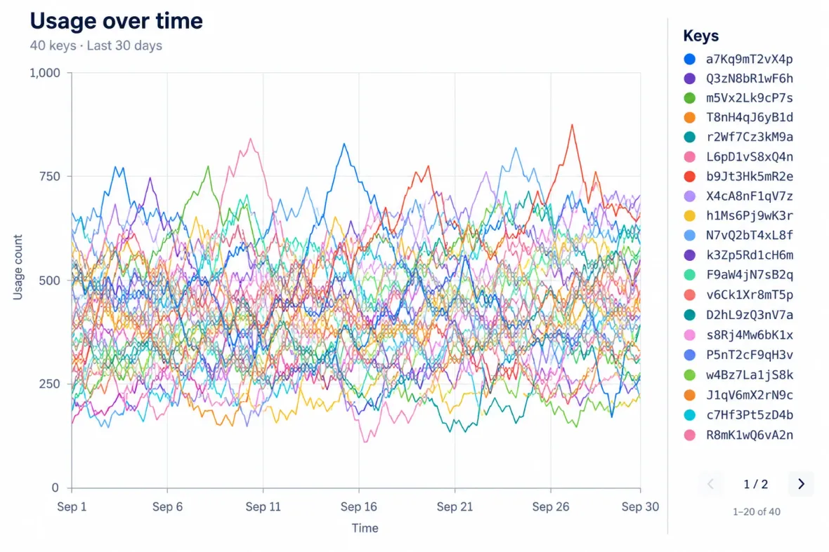
To follow a single key, you have to find its label, remember its colour and pick its trail out of the tangle. The random strings give you little to recognise. Notice an interesting line first, and its label might be on another page of the legend. Even forty beautifully chosen colours would leave a lot of work for the reader.
That chart made the brief of choosing chart colours look rather less straightforward. A row of swatches in Figma, with matching tokens in code, would only cover part of it.
Fifty colours. Use eight.
I went looking at other design systems partly in the hope of borrowing an answer. Atlassian offers eight categorical tokens and recommends showing five or six colours at once. Carbon has an ordered palette of fourteen. Cloudscape provides fifty.
Fifty sounded generous. The same Cloudscape guidance recommends considering up to eight series in a line or bar chart, and five slices in a pie or donut. That was the more useful part of the answer for a chart whose legend already needed pages.
These are recommendations, rather than a fixed limit on what people can read. Research comparing displays with two, four and eight time series found that adding series increased reading time and reduced accuracy. Which display worked best also depended on the comparison people were making.
Lisa Charlotte Muth's advice at Datawrapper gave me a practical starting point: audit the charts your organisation actually makes. A thousand points might belong to a handful of categories. A request for forty colours might reveal a chart that needs fewer things competing for attention.
The numbers agree. Your eyes don't.
As an engineer, I was still drawn to generating colours. Define the qualities we want, let an algorithm search, and make the results repeatable. First, though, I needed controls that described something useful.
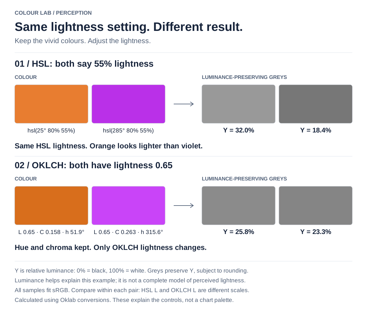
HSL gives us hue, saturation and lightness. Pure yellow and pure blue both have a lightness of 50%. The CSS Color specification uses that pair to demonstrate the problem: yellow looks much lighter. I could hold the lightness number steady and still produce a palette whose colours looked very uneven.
OKLCH offered a better starting point. Built on Björn Ottosson's Oklab model, it describes lightness, chroma—the strength of the colour—and hue, with lightness designed to reflect perception more closely. That would let me explore different hues at a similar apparent lightness, or adjust a brand purple for a dark surface without blindly moving an HSL slider.
Better controls still leave choices to make. Matt Ström's exploration of chart colours for Stripe balances brand resemblance and distinction under colour-vision simulations. Change the weight of a criterion and the search favours it at the expense of others. Even his optimised example leaves orange and green looking similar under one simulation. A better score gives me candidates to investigate.
And the size of the sample matters. Maureen Stone describes Tableau redesigning its subdued background colours, then finding them difficult to distinguish in the tiny colour-picker samples. The team increased the samples' chroma. The same values weren't equally useful everywhere they appeared.
Danielle Albers Szafir's research with points, bars and lines found that size and shape change colour discrimination. For Aperture, that means evaluating candidates as actual marks at the sizes we support. A generous Figma swatch tells me little about a small scatter point.
I would also check the final output after any conversion to our supported colour range, or gamut. A vivid OKLCH candidate may need adjustment to fit sRGB. The delivered values need to survive that adjustment, both themes, and the chart's selected and muted states.
I could generate colour thirty-seven and still leave someone struggling to follow line thirty-seven.
Electronics gets an unsolicited rebrand
Reducing the view brings another decision into focus. Imagine a retail team comparing weekly review volumes across Clothing, Electronics and Home. Electronics is purple. They filter out Clothing, and Electronics turns orange.
The implementation is easy enough to explain. Colours were assigned by position in an array. Remove the first item and everything moves up a place. The chart still shows the right numbers, but Electronics has undergone an unsolicited rebrand.
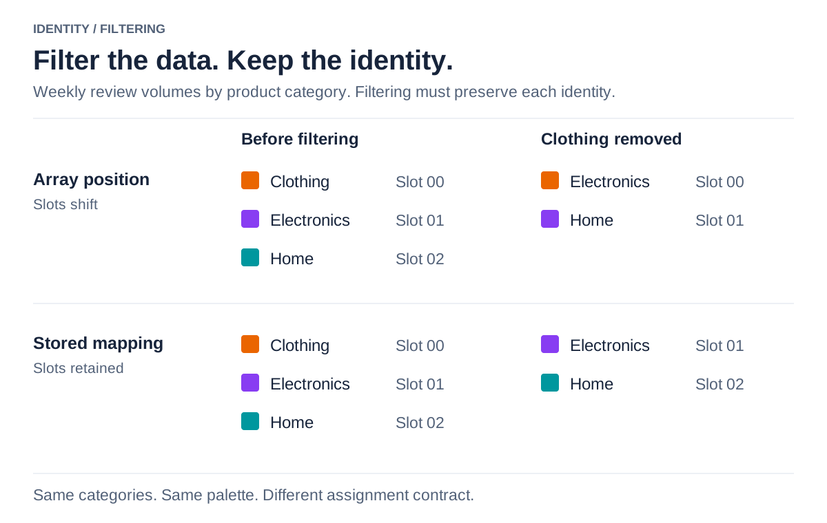
For the reader, that means a pause. Wasn't Electronics purple? Has the selection changed? They check the legend and learn something they already knew.
Each category needs an assignment that survives filtering and sorting, shared across charts where people compare the same categories. Dark mode may need a different purple against its new background, but Electronics should remain recognisable. Looking at the finished swatches would tell you almost nothing about whether this behaviour had been considered.
That needs an explicit agreement in code. D3 warns that inferring category assignments from the order values arrive makes the result depend on that order. I would keep a mapping from stable category IDs to palette slots, shared by related charts and saved when a report needs to preserve it. A renamed category keeps its ID; reopening the report shouldn't give it another rebrand.
What is the colour saying?
Even before anyone clicks a filter, the colours are making suggestions. If most of a dashboard is muted and one bar is bright red, I'm going to look at the red bar first. If the product uses red for errors elsewhere, I may also assume something is wrong.
That's an awkward way to introduce the Home department.
Carbon's guidance separates the jobs colour can do: distinguish categories, show increasing amounts, show values either side of a midpoint, or signal a status. A darker heatmap cell might mean more reviews. A purple bar should help me find Electronics. A sentiment chart needs to distinguish positive and negative responses.
Asking for “colours for lots of data” conceals several different requests. Each needs a choice about what the reader should infer, including meanings we might accidentally suggest.
Even “more” needs care. A darker cell might suggest more of whatever the chart is about, but a rank of one can mean better performance than a rank of ten. Research into numerical and conceptual magnitude examines how those expectations can conflict: people bring the meaning of the quantity to the scale, as well as its numbers.
For someone using Aperture, choosing a sequential scale should come with guidance about its direction and labelled endpoints. For us building it, evenly spaced colour values are only part of the job. We need to check that the progression looks ordered and suggests the intended meaning on the actual background.
Category thirteen
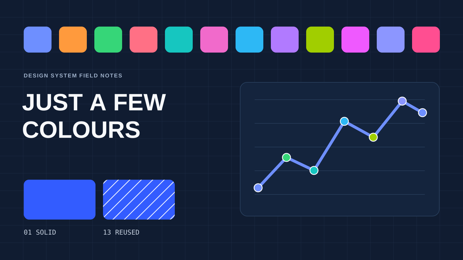
My starting proposal for Aperture was twelve curated colours. Twelve was a working number, to be tested against our product. I still needed an answer for the customer who adds a thirteenth category.
One option was to reuse the first blue with diagonal hatching, keeping the original category's solid fill. The example below extends that treatment to categories fourteen and fifteen.
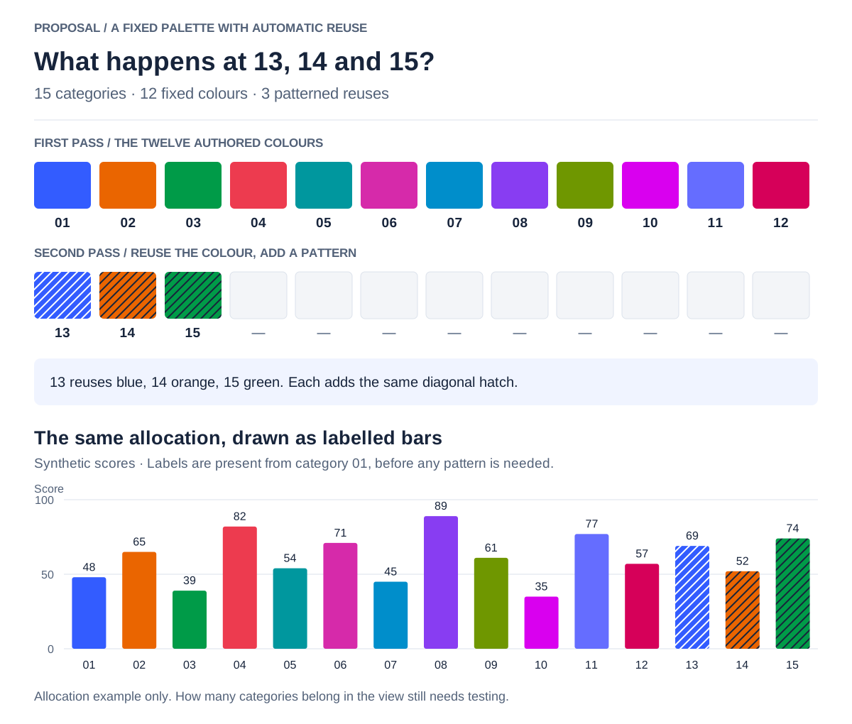
A bar may have room for a hatch; a tiny segment might swallow it. A line would need a different stroke, a scatter point perhaps a different shape. And if a dashed line already means “forecast”, it can't also mean “we ran out of colours”.
We can't wait until category thirteen to give people another way to read the chart. Colour alone mustn't carry the information. These bars have direct labels from the outset. For this comparison, the labels and positions might make a single colour sufficient. The additional colours need to earn their place.
I found it useful to ask three separate questions. Can I see the mark? Can I identify its category? Can I read its value and understand the comparison? A dark line on white might answer the first beautifully and leave me guessing at the other two.
WCAG's non-text contrast guidance generally requires graphical parts needed to understand the content to reach 3:1 against adjacent colours, with exceptions. Which boundaries matter depends on the chart: a line against its background and neighbouring pie slices present different problems. A separator or border can help where a boundary needs to remain visible. One contrast score for each swatch wouldn't cover all those uses.
Nor does adding a pattern make an indefinitely crowded chart readable. Grouping, smaller comparable charts or a filter may help more. If a patterned category remains after filtering, it should keep its appearance.
Back to the chart
For that original usage chart, I would propose an overview showing total usage, then a comparison view where people choose a few keys from a searchable list. Every key stays available. Five comparison slots would be a starting point to test.
I would let people give keys recognisable names, keeping the identifiers available to distinguish them. Each selected line gets a direct label and a stable colour and marker. Remove a key and the others keep their appearance. The chart's labels stay visible while someone searches the list for another key.
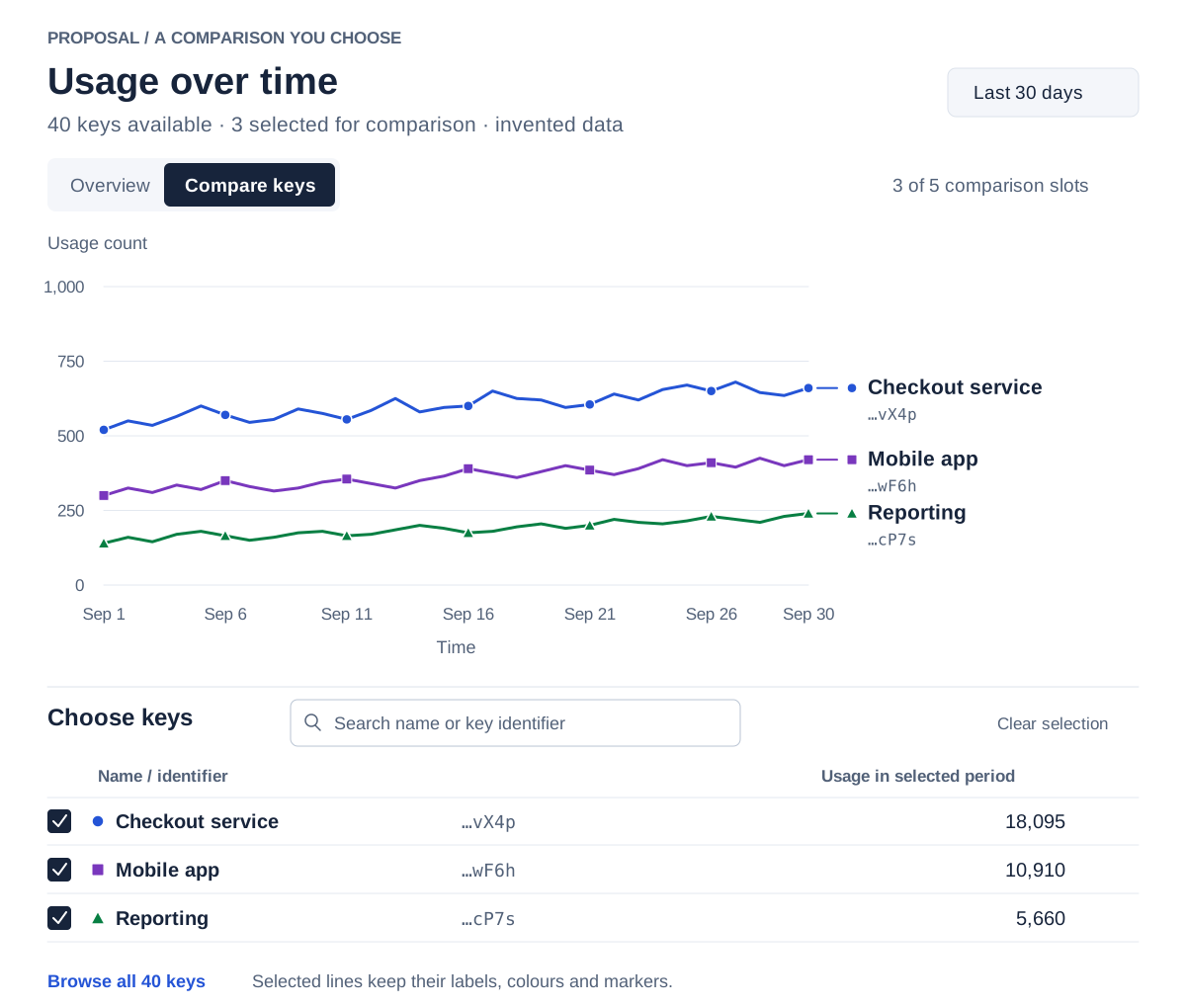
A key someone hasn't selected could still contain an important spike. That needs testing too: can they find the key responsible for a change in the overview? A list sortable by peak usage could help them investigate. Showing only the biggest keys by total usage could miss a brief spike in a quieter one.
This is a proposal, rather than a redesign I've shipped. I would test finding a key, following its usage and comparing it with another, including keyboard access and access to the underlying data. Those results should change the defaults, the comparison limit and the colours where they fall short.
Aperture still needs its twelve candidate colours in Figma and code. Alongside them, I would provide examples at real chart sizes, values for each theme, assignment rules and guidance on when to change the view. A designer should be able to choose a scale that fits the question. An engineer should be able to add a filter without changing what purple means. Both need to know where the proposal has been tested and where judgement is still required.
Don Norman describes good design as “serving us without drawing attention to itself”.
Someone checking usage has their own questions to answer. The time we spend on these decisions should leave them more attention for those questions.